International Influence on Traditional Japanese Cuisine
International Influence on Traditional Japanese Cuisine
SERIES | TEMPORARY SHOWROOM
SERIES | TEMPORARY SHOWROOM
International Influence on Traditional Japanese Cuisine
International Influence on Traditional Japanese Cuisine


BUDDLES | The AI buddy for Children with High Anxiety/PTSD | Concept + App Design + Brand/Name + Identity + Illustrations
BUDDLES | The AI buddy for Children with High Anxiety/PTSD | Concept + App Design + Brand/Name + Identity + Illustrations
BUDDLES | The AI buddy for Children with High Anxiety/PTSD | Concept + App Design + Brand/Name + Identity + Illustrations
BUDDLES | The AI buddy for Children with High Anxiety/PTSD | Concept + App Design + Brand/Name + Identity + Illustrations
BUDDLES | The AI buddy for Children with High Anxiety/PTSD | Concept + App Design + Brand/Name + Identity + Illustrations


IN DEATH, STARFISH ESCAPES THE NARCISSIST'S CAGE
There is but one way to escape the Narcissist.
Symbols : Edelweiss Flower : Mother (Starfish) | Ocean : Child (Architectural Laminate) | Crab Trap : Narcissist
THE MID-CENTURY MODERN CHAIR
Infographic
Applied Arts Winner | 2019
Infographic | Dining in Disneyland

Mark Rothko : An analysis of colors in paintings throughout his career
This timeline breaks out the colors of the most prominent paintings of Mark Rothko, throughout the years.
Each color field represents one painting and acts as an area chart showing what percentage of the painting uses which color(s).
Underneath the area charts along the timeline, is a brief commentary of various life events.
The early years tended to show brighter colors. The later years tend to show a darker palette, in particular in the late 60's, after an aneurism.
International Influence on Traditional Japanese Cuisine
Applied Arts Winner | 2017

Applied Arts Winner | 2018
Solitary Confinement
This student’s initial research showed the usual data of the conditions and poor outcomes of Solitary Confinement.
After digging deeper in her research, she noticed an alarming number of youth were kept in solitary to protect them from volatile home situations. She also learned solitary was considered by the UN to be human torture.
This was where her data overlapped to tell a compelling story.
Visiting Cambodia for the first Time

SAY NO TO NEW TARRIFS | Social Media Ad Series | Motion Info Graphics
Data Postcards | Inspired by "Dear Data"
Front | Infographic | one week of data
Back | How to Read it


Legend | Details
Good Lawyer | Website Explainer Ad
Motion Infographic | Dairy Intolerance
Interactive Information Design | Site Installation Reducing Our Water Footprint
This Interactive Infographic Installation brings to our attention the sheer quantity of water it takes for the agriculture industry to bring food to
our plates.
The user chooses a food item from the digital screen. This in turn lights up the rows of bottles that are 3 deep in a color coded infographic, which matches the food item visually. Each color represents the indicated parts of the food item.
Each bottle that lights up, represents 100 litres of water : the rows are 3 bottles deep.
On the opposite wall the human scale infographics compares the various meats and their water requirements. The water usage is outlined at each step.
100,000 Step Challenge : Tracking the Results
InfoGraphic Portrait : Unforgettable Summers
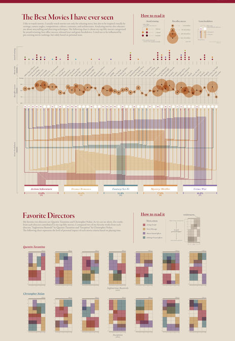
Movie Ratings
A Shopping Event Gone Wrong in Itaewon
Exhibition Design : Le Corbusier
Exhibition Design : Diller Scofidia + Benfro
Ching Shih :
China's most feared Pirate builds her Empire


